• There were many reasons for the change of the site software, the biggest was security. The age of the old software also meant no server updates for certain programs. There are many benefits to the new software, one of the biggest is the mobile functionality. Ill fix up some stuff in the coming days, we'll also try to get some of the old addons back or the data imported back into the site like the garage. To create a thread or to reply with a post is basically the same as it was in the prior software. The default style of the site is light colored, but i temporarily added a darker colored style, to change you can find a link at the bottom of the site.

Covid-19, be Aware!

IdahoMtnSpyder

Active member
There's a lot of stuff floating around the Internet about Covid-19 so I thought I'd share some info that I believe is as reliable as can be. This is in the interest of presenting facts, not fear. The graphs below come from https://www.worldometers.info/coronavirus/. Another reliable website with numbers regularly updated is https://coronavirus.jhu.edu/map.html.

First, if you buy lottery tickets because "maybe, just maybe" you will hit the jackpot take note that your chances of winning the Powerball are on the order of 1 in 300 million. Today, your chances of contracting Covid-19 are about 1 in 20 thousand. That chance increases each day as the reported cases numbers increase.

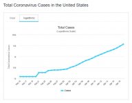
Here are two graphs of the day to day number of cases of Covid-19 in the US. The first one is a linear graph which shows the total number on the Y axis. The second one is a logarithmic graph that shows how the numbers go up in a multiplying fashion, i.e., the number of days to go from 1 to 10, 10 to 100, 100 to 1000, and so on. What I don't know is how much these numbers are impacted by the increasing number of tests performed each day, but the general trends are valid.
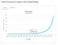
US 3-20 linear.JPG US 3-20. log.JPG

Note that the log graph shows the line bending slightly more upward the past few days. That means the time to go the next multiple of 10 is getting shorter.

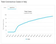
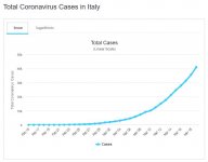
For comparison here are the graphs for Italy, the hottest of the hot spots in Europe.
Italy 3-20 linear.JPG Italy 3-20 log.JPG

What I find interesting is the Italy linear graph doesn't climb as rapidly as the US graph. For the time frame ending yesterday, 3/19, in Italy the time for the number to multiply by 100 was about 21 days. Here in the US it was about 16 days. This is in spite of the fact the US population density, overall, is only 1/6 of that of Italy.

Here are the graphs for China, where it all started.

China 3-20 linear.JPG China 3-20 log.JPG

I see two take aways from these graphs. Clamping down severely on the movement of people stems the growth of the virus. If you recall from the news China prohibited unnecessary travel as soon as they recognized there was a real problem. That will not happen in the this country to the same degree. The other take away is the growth in infections will decrease in time.

There are many more numbers and graphs on the website above.

This information should dispel any notion that Covid-19 is not the problem the news media makes it out to be. It is. And it should drive home the necessity of restricting travel and personal contacts, the primary transmission method. Yes, there are many unknowns such as how contagious is someone between being infected and starting to show symptoms. In a report this morning on NPR a woman said she infected 4 out 6 lunch companions at a lunch a day before she started having symptoms.

If in the next 10 days the number of infections goes up by a factor of 10 as the graphs indicate it well could, then the number of infections will be on the order of 1 in 2000. For me anyway, that probability is too high for comfort.

ARTraveler, and others who know statistics, please correct any misinformation I may included above. This issue is too serious to leave bad information floating out there.
 
I know some information about statistics, but not enough to comment on the above. That one is above my pay grade.

As long as it does not get into a shouting match, we are okay with the information so far.
 
Sorry off topic Here in Vermont we just had our first 2 deaths from the Corovirus. Both of them were elderly.


Deanna
 
Sorry off topic Here in Vermont we just had our first 2 deaths from the Corovirus. Both of them were elderly.
One of the pages on the worldometer website lists percent fatality by age groups. Ranges from zero for kids 0 to 9 to 15% for those over 80, for all cases of coronavirus, For confirmed cases it's almost 22% for the 80 + group.

New info in the last day or two shows males are almost twice as likely to die as are females.
 
Is there anyway to overlay each graph, aligning a common point, say first case. The USA trend is appearing dismal, however the other graphs have steep changes, just not fully certain how each truly compares to the other.
 
Is there anyway to overlay each graph, aligning a common point, say first case. The USA trend is appearing dismal, however the other graphs have steep changes, just not fully certain how each truly compares to the other.

I'll take a look at it. The challenge will be to mesh the various values of the Y axis so the overlay is valid. I don't think the data is available for download as a CSV or whatever so getting the daily numbers might be more than I want to try to do. I think the most meaningful comparison country to country is the slope of the logarithmic graphs. If you go to the website and put your cursor on the graph the value for that day pops up. As I mentioned, if you look at how many days it took Italy vs US to increase ten fold you'll see the US took fewer days. To me that is the best indicator of just how fast the infections are spreading and normalizes the total numbers between the graphs.
 
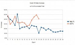
After thinking about PMK's question here is what I came up with. I put the daily increase in cases for both US and Italy in a spreadsheet. I then calculated the daily increase as a percent of the previous days grand total of cases. This way we can see how the US daily increase compares to the Italy increase. The data for both countries starts with the day of the first noted cases, which for Italy was 02/21/20 and for the US 03/02/20. So day #1 is 02/21 for Italy and 03/02 for US. The graph starts at day 6 because the numbers really jump around the first several days and a comparison is meaningless. In fact you'll see the graphs don't start stabilizing until about day 11. After day 13 the daily increase, as a percentage of the total, starts to decrease for Italy and increase for the US. The US graph is too short to be really reliable. Note the drop in today's number. We will get a better picture of the rate of increase in about another week. Will the US trend follow the Italy trend? We'll have to wait and see. I think Italy back about day 6 clamped down on the movement of people. The US hasn't nearly as much.

IMO, we in the US need to get serious about staying put until this thing blows over. Right now, as I see it, the experience of Italy shows why we must. If we don't there's no way of knowing what kind of hell we are in for as we willy nilly spread the virus around.

US vs Italy daily increase.jpg

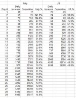
Here are the numbers I used.

US vs Italy daily increase table.JPG
 
This isn't likely to change anyone's mind. Those who think it's a hoax tend not to reason anyway. The rest of us realized it was a problem a couple of weeks ago.
 
Here in the Uk like over the pond we were slow to act... carried on with life as normal mixing and flying about on planes.. my advice to you all is quit flying … wash your hands more when your out and about. Pubs resteraunts and cafes have just been told to shut, for some strange reason everyone has panic bought all the toilet roll. Shops are running low on stocks as people strip the shelves of goods in cans they can store and pasta. Im not saying its going to happen where you are, but best prepare yourselves a little just in case. As for your graphs ..you can prove anything with statistics apart from the truth. The virus will come and run its course like here in the UK... a graph will make no difference...all you can do is take precautions to protect yourselves and don't starve. Oh and ride safe!
 
After thinking about PMK's question here is what I came up with. I put the daily increase in cases for both US and Italy in a spreadsheet. I then calculated the daily increase as a percent of the previous days grand total of cases. This way we can see how the US daily increase compares to the Italy increase. The data for both countries starts with the day of the first noted cases, which for Italy was 02/21/20 and for the US 03/02/20. So day #1 is 02/21 for Italy and 03/02 for US. The graph starts at day 6 because the numbers really jump around the first several days and a comparison is meaningless. In fact you'll see the graphs don't start stabilizing until about day 11. After day 13 the daily increase, as a percentage of the total, starts to decrease for Italy and increase for the US. The US graph is too short to be really reliable. Note the drop in today's number. We will get a better picture of the rate of increase in about another week. Will the US trend follow the Italy trend? We'll have to wait and see. I think Italy back about day 6 clamped down on the movement of people. The US hasn't nearly as much.

IMO, we in the US need to get serious about staying put until this thing blows over. Right now, as I see it, the experience of Italy shows why we must. If we don't there's no way of knowing what kind of hell we are in for as we willy nilly spread the virus around.

View attachment 179688

Here are the numbers I used.

View attachment 179689

Thank you.

Taking this a step further, can the number of cases be represented as a function based percentage of total population? If the information exists, maybe also percentage of population in specific areas of the USA.
 
Illinois is on lockdown starting at 5pm. I know I dont want to get sick . I work for a company that is essential so will be still working.

Keep clean, stay 6 feet away from others. And stop hording TP and other items. It does not help others that are in need.
 
As for your graphs ..you can prove anything with statistics apart from the truth. The virus will come and run its course like here in the UK... a graph will make no difference...all you can do is take precautions to protect yourselves and don't starve. Oh and ride safe!
Yes, you can prove anything with statistics if manipulated enough. That thought was uppermost in my mind while writing my comments so I tried to keep it as honest and realistic as possible. And yes, the virus will run its course, but if we are aware of the gravity of the situation, and respond accordingly, we can influence its run, hopefully for the better.

All I'm wanting to do is make it objectively clear that the situation is grave, and needs to be addressed properly and adequately.
 
Not much of a stats person, shouldn't country population be factored in also? Dale
Yes and no as I understand such issues. I'm not a statistics expert, but am moderately familiar with the science. I relied on it quite a bit as a Quality Assurance Engineer in years past. In terms of raw numbers the greater the population the greater the number of infections. When compared on a percentage of population basis you can make comparisons that are meaningful, at least somewhat. I tried to bake that into my comments above. I am not a epidemiological expert, but I do believe I can think rationally. I'm basing my comments on the concept that given all factors being similar a virus will spread from 1% to 10% to 50% of the population at a similar rate whether the population is 10 million or 100 million, and similarly dispersed. You would think if a population is dispersed much more widely in one country that the rate of spread will be slower in the less dense country. But, what I see in the numbers that doesn't seem to be the case of US compared to Italy. The virus is spreading faster, on a per million population basis, in the US than in Italy even though the population density of the US is only 1/6 that of Italy. I haven't closely compared the numbers for Germany, France, and the UK, against the US, But when I looked at the graphs they show similar rates of infection growth to that of Italy, and since Italy has had the second most number of infections I decided it would be a good choice to compare to the US.
 
Taking this a step further, can the number of cases be represented as a function based percentage of total population? If the information exists, maybe also percentage of population in specific areas of the USA.
I used data that is readily available. I would like to see and compare numbers from cities like New York and Los Angeles and they're probably available somewhere, but requires more in depth digging than what I feel is needed to grasp the overall picture.

I'm sure a function could be defined but my college math training has long ago gone dormant! I see a problem with doing that anyway. The data is so short term yet at this point that the erratic nature of it would cause a 95% confidence interval to be pretty wide. That diminishes the value of a formula. Plus, I think a visual presentation like a graph makes the situation more understandable. An example from my QA days at the Dept of Energy has to do with how fast a dike holding back water from the Gulf of Mexico was subsiding. Our operating contractor was crying wolf and said the dike would be overrun in just a few years. I asked for, and got, the data behind that argument. When I analyzed it I told my bosses and the contractor that the dike was just as likely to sink only 6 inches as it was to sink 6 feet over the next 15 years. More data over more time was needed to get a more accurate estimate.
 
Back
Top