• There were many reasons for the change of the site software, the biggest was security. The age of the old software also meant no server updates for certain programs. There are many benefits to the new software, one of the biggest is the mobile functionality. Ill fix up some stuff in the coming days, we'll also try to get some of the old addons back or the data imported back into the site like the garage. To create a thread or to reply with a post is basically the same as it was in the prior software. The default style of the site is light colored, but i temporarily added a darker colored style, to change you can find a link at the bottom of the site.

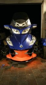
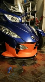
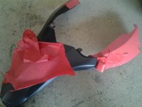
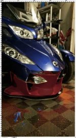
Plasti diped my bike... not sure if I like it...

dmfahie

New member
attachment.php
attachment.php
Plasti diped the front.... kinda like it... kinda not sure... if I were to keep it I would carry the orange to the back.. your thoughts please.
 

Attachments

  • FB_IMG_1441167693540.jpg
    FB_IMG_1441167693540.jpg
    33.8 KB · Views: 1,098
  • FB_IMG_1441167702601.jpg
    FB_IMG_1441167702601.jpg
    39.1 KB · Views: 1,093
Ahhh...!!

the good thing is you can peel it off...:thumbup:
attachment.php
wasn't sure either...:dontknow: give it some time it may grow on you...:lecturef_smilie:
 

Attachments

  • 20150511_092410.jpg
    20150511_092410.jpg
    51.6 KB · Views: 1,039
This is a personal taste issue, but for me the orange isn't the right color for this - the color pallets of the blue and orange just aren't working together, and the brightness of the orange takes away from the blue and makes it too bottom heavy. I'd go in the other direction and make the bottom darker rather than lighter. Their special series works because the red wine feels like there is black above and below it.

What about a nice, deep red?

attachment.php
 

Attachments

  • 2015-09-01 11.43.45 pm.jpg
    2015-09-01 11.43.45 pm.jpg
    38.6 KB · Views: 1,005
This is a personal taste issue, but for me the orange isn't the right color for this - the color pallets of the blue and orange just aren't working together, and the brightness of the orange takes away from the blue and makes it too bottom heavy. I'd go in the other direction and make the bottom darker rather than lighter. Their special series works because the red wine feels like there is black above and below it.

What about a nice, deep red?

attachment.php

We photoshopped many colors first.. orange won.. my original thought was a light blue for a two tone.... I may have to play with a few colors
 
attachment.php
attachment.php
Plasti diped the front.... kinda like it... kinda not sure... if I were to keep it I would carry the orange to the back.. your thoughts please.


I LIKE IT!! :thumbup::thumbup: But I'm a bronco fan and if you were in Colorado it would be a big hit. nojoke jtpollock
 
Never criticize a man's hunting dog, his Wife, or his style... nojoke
The only thing that matters: do YOU like it? :shocked:
 
Pretty cool, I think orange and blue are great together. I think the problem you are running into is your blue is really shiny and the orange is not, but other than that I think it is just fine! Does this stuff come in lots of colors? How cool is that! So neat that you can just peel it off if you get tired of it, or don't like it. It probably protects the paint too underneath?
 
attachment.php
attachment.php
Plasti diped the front.... kinda like it... kinda not sure... if I were to keep it I would carry the orange to the back.. your thoughts please.

Keep the orange and carry the orange theme to the blue. Just add a little bit of orange graphic to the blue to tie the orange color into the rest of your spyder. Also carry a little blue to the orange front end just to break the orange up so the front end does not look so heavy. Wrap my spyder or a vinyl graphic shop could help you out too. I really like the two color combinations. Looks great !!:firstplace:
 
Back
Top